
Transform your home’s atmosphere by selecting colors that reflect natural light and complement your existing décor. Before diving into color selection, prepare your walls properly to ensure professional-looking results. Create visual harmony by following the 60-30-10 rule: choose a dominant color for 60% of the space (walls), a secondary color for 30% (furniture), and an accent color for 10% (accessories).
Modern neutral palettes featuring warm greys, soft whites, and earthy tones provide versatility and timeless appeal, while bold accent walls in deep blues, forest greens, or rich terracottas add personality to specific spaces. Consider your home’s architectural style and natural lighting patterns when selecting shades – south-facing rooms can handle cooler tones, while north-facing spaces benefit from warmer hues that enhance limited natural light.
Test paint samples during different times of day to understand how your chosen colors respond to changing light conditions, ensuring your final selection creates the desired atmosphere throughout the day.
Current Color Trends That Stand the Test of Time
Timeless Neutrals
Neutral colors remain among the most popular and enduring color choices for home interiors, offering timeless appeal and incredible versatility. Shades like warm beige, soft greige, classic ivory, and sophisticated taupe create a perfect backdrop for any decorating style while maintaining resale value.
These neutrals work exceptionally well in open-concept spaces, helping to create flow between rooms while providing a calm, welcoming atmosphere. Layer different neutral tones to add depth and interest – try combining warm and cool neutrals or experimenting with various textures in the same color family.
For best results, test neutral paint samples at different times of day, as natural light can significantly affect how these colors appear. North-facing rooms often benefit from warmer neutrals, while south-facing spaces can handle cooler tones. Consider using pure white trim to create clean lines and definition against neutral walls.
Remember that neutrals don’t have to be boring – incorporate subtle undertones of blue, green, or purple to add sophisticated complexity while maintaining the versatile nature of your color scheme.
Statement Colors That Work
When making a bold statement with your home’s color, certain shades stand out while maintaining broad appeal. Navy blue commands attention while offering timeless sophistication, especially on exterior walls or as an accent wall in living spaces. Deep forest green brings natural drama and pairs beautifully with both modern and traditional architecture.
For those seeking warmth, burnt orange or terra cotta creates an inviting atmosphere without overwhelming the space. These earthy tones work particularly well in southwestern-style homes or as accent colors in contemporary settings. Rich burgundy adds luxury to dining rooms and studies while remaining classically appealing.
Charcoal gray serves as a modern alternative to black, offering depth without the stark contrast. It’s particularly effective on exterior features like doors or window frames. Deep purple, when used thoughtfully, can add personality to powder rooms or dining spaces while maintaining sophistication.
Remember that statement colors work best when balanced with neutral tones and proper lighting. Consider testing samples in different lighting conditions before committing to ensure the bold choice achieves your desired impact.
Room-by-Room Color Selection
Living Room Colors That Welcome
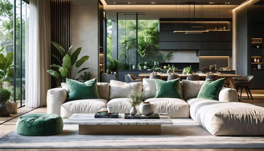
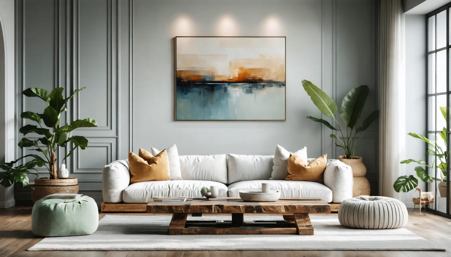
Transform your living room into a welcoming sanctuary with carefully chosen colors that create the perfect atmosphere. Neutral tones like warm beige, soft gray, and creamy white provide a versatile foundation that works with any decor style. These colors are particularly effective in smaller spaces, making rooms feel more open and airy.
For a more dramatic impact, consider deep navy blue or forest green on an accent wall, which adds sophistication while maintaining a cozy feel. Earth tones like terracotta and sage green bring natural warmth and create an instant connection to the outdoors, especially effective in rooms with plenty of natural light.
If you’re feeling bold, try dusty rose or muted gold to add personality without overwhelming the space. These colors work particularly well when balanced with neutral furnishings. Remember that lighting plays a crucial role – test paint samples during different times of day to ensure your chosen color maintains its appeal from morning to evening.
For maximum versatility, consider a two-tone approach, using a lighter shade for most walls and a complementary darker tone for focal points.
Bedroom Colors for Better Sleep
The colors you choose for your bedroom can significantly impact your sleep quality. Soft, muted tones create a peaceful atmosphere that promotes relaxation and rest. Light blues and gentle greens mimic nature’s calming elements, making them excellent choices for promoting better sleep. Pale blue, in particular, is known to lower blood pressure and heart rate, creating ideal conditions for rest.
Neutral colors like warm grays, soft whites, and gentle beiges provide a serene backdrop that won’t overwhelm your senses. These colors work well with natural lighting and can make your bedroom feel more spacious and airy. Lavender, a lighter shade of purple, combines the calming properties of blue with the warmth of red, offering a perfect balance for relaxation.
Avoid bright, energetic colors like pure red, orange, or yellow in your bedroom, as these can stimulate the mind and make it harder to fall asleep. Instead, opt for earth tones or pastel versions of these warmer colors if you’re drawn to them. Remember that the finish of your paint matters too – choose flat or matte finishes to reduce glare and create a more soothing environment.
Kitchen Colors That Inspire
The kitchen is the heart of your home, and choosing the right colors can transform it into an inspiring culinary haven. For a vibrant, energetic space that stimulates appetite and creativity, consider warm yellows or sunny oranges. These shades naturally complement wooden cabinets and create an inviting atmosphere for family gatherings.
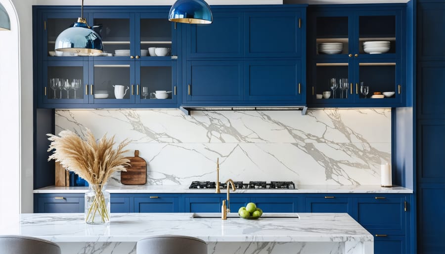
For a more sophisticated look, deep navy blue paired with crisp white cabinets offers timeless appeal while making stainless steel appliances pop. Sage green brings a natural, calming element to busy cooking spaces and works beautifully with both modern and traditional kitchen designs.
If you’re seeking a neutral palette that won’t overwhelm, warm greys or soft creams provide an excellent backdrop for colorful accessories and kitchen tools. For smaller kitchens, light blues or mint greens can make the space feel larger and more airy while adding personality.
Remember to consider your kitchen’s natural lighting when selecting colors. North-facing kitchens benefit from warmer tones, while south-facing spaces can handle cooler hues without feeling cold or clinical.
Bathroom Colors That Refresh
The bathroom demands colors that promote cleanliness while creating a spa-like atmosphere. Light blues and aqua tones naturally complement water features and evoke a sense of freshness. Consider seafoam green or pale turquoise for a rejuvenating feel that makes your morning routine more energizing.
White remains a classic choice, but modern bathrooms benefit from warming it up with cream or pearl undertones to avoid a clinical feel. For a touch of sophistication, light gray with blue undertones creates a serene environment while maintaining brightness.
Natural-inspired colors like sage green or soft sand can bring the outdoors in, making your bathroom feel more connected to nature. These earthy tones work particularly well with natural lighting and wood accents.
If you’re feeling bold, deep navy or forest green can create a dramatic effect when used on a single accent wall, especially when paired with white fixtures and chrome or brass hardware. Just ensure your lighting plan can handle darker shades without making the space feel cramped.
For smaller bathrooms, stick to lighter shades on most surfaces to maximize the feeling of space and reflect available light.
Color Combinations That Never Fail
Modern Home Color Schemes
Modern homes embrace bold contrasts and sophisticated neutrals that create striking visual impact while maintaining a timeless appeal. The most popular contemporary color schemes often pair crisp whites with deep charcoal grays or soft blacks, creating a clean, minimalist foundation that’s both versatile and elegant.
For a modern twist on neutrals, consider combining warm greige (gray-beige) with matte black accents and brushed metallic fixtures. This combination works particularly well in open-concept spaces where color flow is crucial. Another trending approach pairs sage green with warm whites and natural wood tones, bringing an organic element to contemporary spaces.
Color blocking has become increasingly popular in modern homes, with homeowners using geometric patterns to create focal points. Try combining slate blue with pale gray and white for a sophisticated look that adds depth without overwhelming the space. For those seeking more dramatic impact, deep navy walls with white trim and brass accents create a luxurious, contemporary feel.
Monochromatic schemes using different shades of the same color remain a modern classic. Consider varying tones of warm gray or taupe to create subtle dimension while maintaining a cohesive look. For accent walls, rich emerald green or deep burgundy can add personality while still feeling sophisticated and current.
Remember that modern color schemes often rely more on texture and finish than multiple colors, so consider incorporating matte, glossy, and metallic finishes within your chosen palette.
Traditional Home Color Pairings
Traditional homes exude timeless elegance, and certain color combinations have stood the test of time for good reason. White paired with deep navy blue remains a classic choice for exteriors, creating a sophisticated look that’s especially striking on Colonial-style homes. For interior spaces, warm beige combined with crisp white trim offers a versatile foundation that works in any room.
Sage green and cream form another beloved pairing, bringing a natural, calming presence to living spaces while maintaining traditional appeal. This combination works particularly well in dining rooms and studies. For those seeking something slightly bolder, burgundy and ivory create a rich, elegant atmosphere perfect for formal living rooms or master bedrooms.
Earth tones continue to dominate traditional color schemes, with combinations like warm brown and soft gold creating inviting spaces that feel both grounded and refined. In traditional kitchens, cream cabinets paired with deep forest green walls offer a timeless look that’s gaining renewed popularity.
For exterior trim and architectural details, consider these time-tested combinations: chocolate brown with cream accents, deep gray with white trim, or colonial red with soft white details. These pairings enhance architectural features while maintaining the home’s traditional character. Remember that these classic combinations have endured because they complement traditional architectural elements while creating welcoming, sophisticated spaces.
Professional Tips for Color Selection
Testing Colors Like a Pro
Before committing to a color scheme, it’s essential to test your chosen shades thoroughly. Start by getting sample pots of your preferred colors and following this expert advice on choosing colors to ensure the best results.
Paint large swatches (at least 1m x 1m) on different walls in your room, as colors can appear dramatically different depending on lighting conditions. Observe these test patches during various times of the day – morning, afternoon, and evening – to see how natural and artificial light affects the shade.
For the most accurate representation, apply two coats of your test colors and allow them to dry completely. Remember that colors often appear darker on larger surfaces than they do on small paint chips. Position your furniture and decorative items near the test patches to see how they interact with your existing décor.
Take photos of the test patches under different lighting conditions and review them away from the space. This helps provide a fresh perspective and can reveal undertones you might have missed. Consider creating a digital mood board with your test photos alongside images of your furniture and accessories to visualize the complete look.
Give yourself at least 48 hours to live with the test patches before making a final decision. This allows time for the paint to cure fully and for you to experience the color in different scenarios.
Light Considerations
Light plays a crucial role in how paint colors appear in your home, and understanding this relationship can help you make better color choices. Natural daylight shows colors in their truest form, but its intensity and direction can vary throughout the day and across different rooms.
North-facing rooms receive cooler, indirect light that can make colors appear more muted. In these spaces, warm colors like creamy whites, golden yellows, or coral tones can help counteract the cool light and create a welcoming atmosphere. South-facing rooms, however, benefit from bright, warm light throughout the day, making them more versatile for color choices.
Artificial lighting also significantly impacts color perception. LED bulbs tend to enhance blue and green undertones, while traditional incandescent bulbs warm up colors, making reds and yellows appear more intense. Fluorescent lighting can cast a cool blue tinge that might make warm colors appear dull.
Before committing to a color, test paint samples on different walls and observe them at various times of day. Many DIY painters recommend using large sample patches rather than small swatches to get a better sense of how the color will look in your space. Remember that colors often appear more intense on larger surfaces, so consider going a shade lighter than your sample if you’re unsure.
Choosing the perfect paint colors for your home is a journey that combines personal expression with practical considerations. Whether you’re drawn to calming neutrals, bold statement walls, or coordinated color schemes, the right palette can truly enhance your home’s character and create the atmosphere you desire. Remember to consider natural lighting, room size, and existing décor when making your selections. Test your chosen colors with sample patches, observe them at different times of day, and trust your instincts while following the design principles we’ve discussed.
Don’t be afraid to experiment with different combinations or seek inspiration from nature, art, or design trends. With proper preparation, quality materials, and attention to detail, your painting project can transform your living spaces into personalized sanctuaries that reflect your style and personality. Take the first step today by selecting your favorite color combinations and creating a plan to bring your vision to life. Your perfectly painted home awaits!
Related Posts

Post a Comment